Article content
Opening a RAW file often feels underwhelming.
The camera captures data. It records the brightness and a white balance. Yet, it often misses the cold bite of the wind, the silence of the night, or the warmth of the first light hitting the horizon. My editing process focuses on restoring that feeling. I use color to translate the physical experience of the landscape into the final image.
To create images that feel atmospheric, or cinematic, we need to move beyond simple color correction and understand how color shapes emotion. In this article, I will share how I approach cinematic color grading in Lightroom and how you can use specific tools to build a consistent atmosphere.
Color is more than aesthetics
Filmmakers use specific palettes to guide the audience's emotion. A cold, blue scene signals isolation or calm. A warm, golden scene signals safety or nostalgia. Landscape photography works the same way. Curating the colors allows you to control the mood of the image.
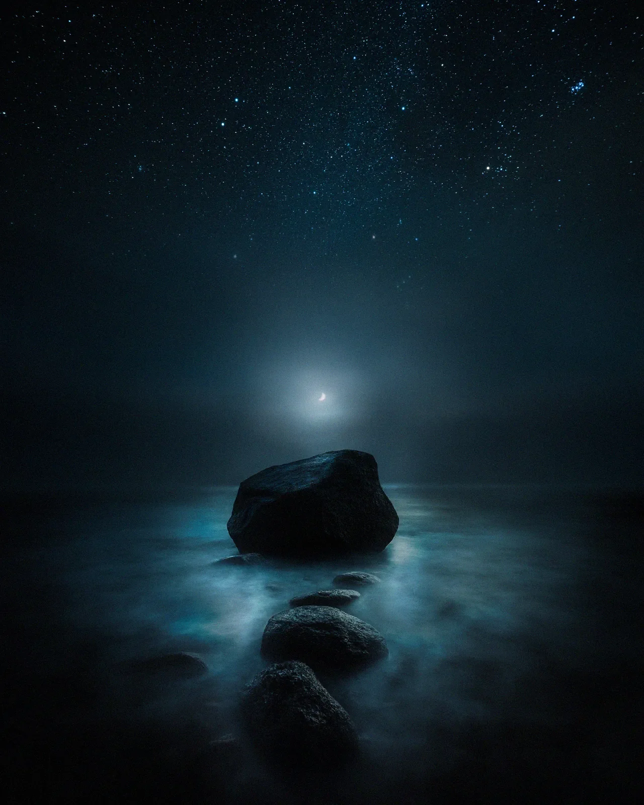
I always start with the dominant feeling of the location. If I stood in the biting cold of Lapland, a neutral white balance neutralizes the experience. I lean into the blues to communicate that cold to the viewer.
Using cool tones to create space
Living in northern Europe, cool light defines my work. Psychologically, blue creates distance, space, and silence. I pay close attention to the specific shade of blue I use.
Cyan and Aqua ~ These tones feel dreamlike and mystical. I often use them in the highlights or mid-tones of snow. I often push the Blue Hue slider slightly towards Aqua (around -10 to -15) to separate the image from reality.
Deep Navy ~ This feels grounded and serious. It belongs in the shadows and the night sky.
Subtly shifting the blues in the HSL (Hue, Saturation, Luminance) panel changes the personality of the image entirely. A small shift in the blue hue toward cyan can turn a cold scene dreamlike, while pushing it toward navy makes it feel heavier and more grounded.
Of course, color grading is much easier when the light is already perfect. This is why I prefer shooting during the quiet moments after sunset. Read more about my lighting approach in Why I Stopped Chasing the Golden Hour.
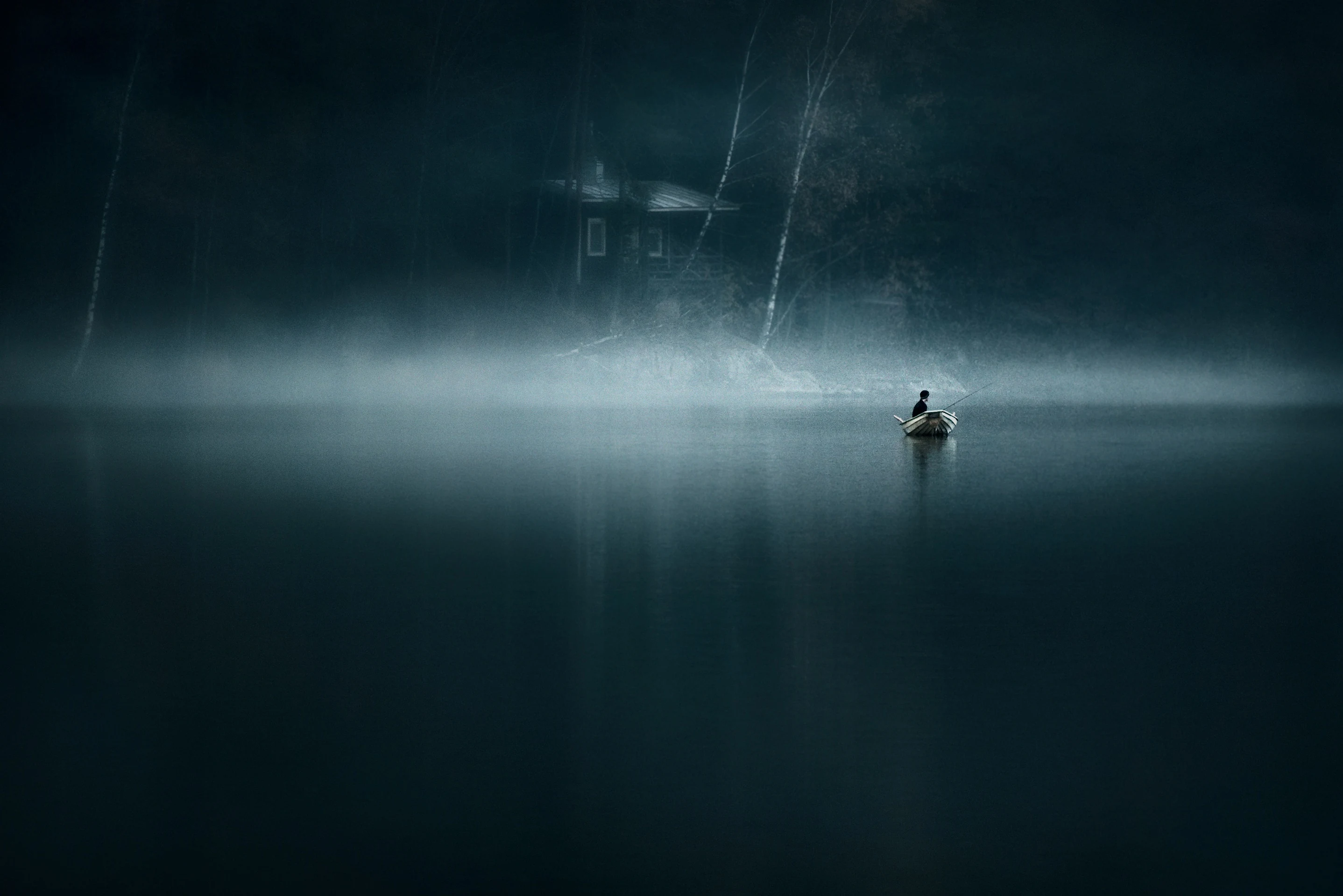
Adding dimension with warmth
A purely monochromatic blue image risks feeling flat. To create dimension, I use the principle of complementary colors. On the color wheel, blue sits opposite orange. In a scene that is 90% cool and blue, I look for a touch of warmth.
A street light in the distance.
The last glow of the sun.
Illuminated windows in a cabin.
That small warm element makes the blue feel colder by comparison and gives the eye a distinct focal point.
Step-by-step - separating shadows and highlights
My primary tool for this is the Color Grading panel in Lightroom (formerly Split Toning). Increasing global saturation often makes an image look digital. Separating the tones creates a cleaner, more painterly result. My typical approach is subtle.
Shadows ~ I add a cool tone (Blue or Teal) to the shadows. Try setting the Hue to 210-220 (Deep Blue) and keep Saturation low (around 10-15). This mimics how shadows in nature reflect the blue sky.
Highlights ~ Add a warm tone. Set the Hue to 35-45 (Warm Orange) with subtle Saturation (5-10).
This separation unifies the messy colors of nature into a cohesive palette.
Developing your own color identity
Color is a language. Over time, you will gravitate towards certain hues. Some photographers prefer deep forest greens and moody earth tones. Others prefer the pastel pinks of sunrise. I have found my voice in the cool, quiet tones of the North. Identifying the repeating colors in your portfolio helps you clarify your artistic identity.
Consistency in color grading helps build a recognizable style across your portfolio.
Final thoughts
Color grading amplifies the emotion already present in the scene. This is especially true when images are printed large. Subtle color decisions are what allow a photograph to hold attention when viewed up close. Pushing the white balance away from correct often brings the image closer to true. The goal is to share the feeling of the moment, not just the data.
FAQ on cinematic landscape photography
What is the best white balance for cinematic photography? There is no single "correct" setting. However, for a moody, cinematic look, try setting your white balance slightly cooler (lower Kelvin value, e. g., 4500K-5000K) to emphasize the atmosphere, especially in blue hour shots.
Do I need Photoshop for color grading? No. Lightroom’s Color Grading wheels and HSL panel are powerful enough for 95% of landscape work. Photoshop is useful for advanced masking and precise color separation.
Want to master this editing style? If you want to learn my full editing workflow, from RAW adjustments to final color grading in Photoshop, my Complete Landscape Photography Bundle includes in-depth tutorials on creating atmospheric images.
Recommended
EPIC Presets
Turn your RAW files into finished atmospheric photographs. A complete Lightroom system from base toning to final mood.