Visual Philosophy

Creating a Signature Style

Why Your Portfolio Needs Less, Not More

Most photographers eventually face the same problem. You have taken thousands of photos. You know the technical rules. Yet when you look at your feed or website, it looks like a collection of random singles rather than a cohesive body of work.

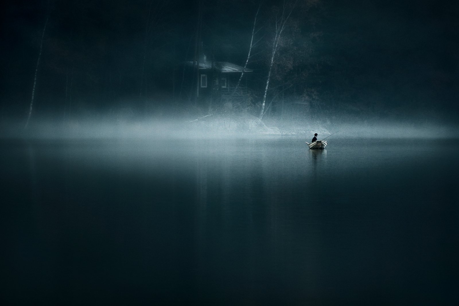
Atmospheric landscape photography showing signature style

The Trap of Being Good at Everything

When we start photography, we want to shoot everything. Macros, portraits, street photography, sunsets, and architecture. We are hungry to learn.

This creates a chaotic portfolio. If a viewer visits your site and sees a black and white street photo next to a vibrant sunset landscape, they do not know what to expect from you. They cannot trust your vision because your vision is changing with every frame.

A signature style does not happen by accident. It comes from decisions. It comes from choosing what to shoot and, more importantly, what to leave out.

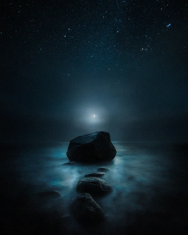
Minimalist landscape photography

Want a faster way to achieve consistency? Explore the EPIC Preset Collection.

Define Your Visual Anchors

A signature style is built on consistency. You need visual anchors that tie your work together. These are the elements that appear in your images repeatedly.

Atmosphere

Fog, mist, or snow. The weather is a character in the image.

Light

Blue hour, moonlight, or soft diffuse light. Avoiding harsh midday sun.

Color Palette

Blues, desaturated tones, and deep blacks.

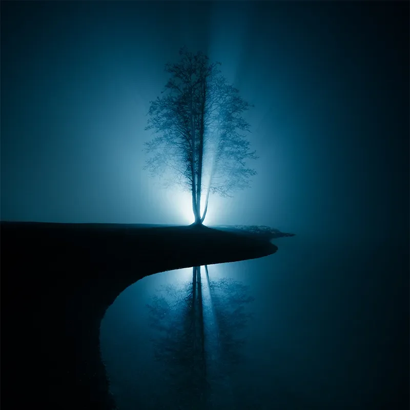
Atmospheric blue hour photography
"If you have to explain why a photo fits, it probably does not."

Consistency in the Field

Editing cannot fix a lack of vision. Consistency starts when you are standing behind the camera. Many photographers chase "good light" without defining what good light means to them.

I realized years ago that the harsh midday sun and even the peak of a bright sunset often worked against the mood I wanted. I started shooting earlier in the morning or later in the evening. By returning to similar lighting conditions, your images start to look like they belong to the same family.

Treat Presets as Film Stock

Think of your editing process like choosing a film stock. A photographer using Kodak Portra 400 knows how the colors will render. They do not switch to a black and white film in the middle of a roll just because they feel like it.

Dark lake photography showing consistent editing style

The Wall Test

A screen is forgiving. A backlit display makes almost any image look vibrant for the three seconds someone looks at it. A print is honest.

When a photograph is printed large and framed on a wall, it has nowhere to hide. It takes up physical space. You have to live with it. If the composition is restless or the editing is trendy, the image becomes exhausting to look at after a week.

My curation standard is simple: Would I hang this on my own wall? If the answer is no, it does not belong in the portfolio.